Cosplay Photography Poses and Composition | A Beginner's Guide to Eye-Catching Shots
Cosplay Photography Poses and Composition | A Beginner's Guide to Eye-Catching Shots
If your photos always look the same, the problem probably isn't your poses — it's that you're thinking about poses in isolation. The moment you start considering pose, composition, framing, and light as a single system, the quality of your shots takes a genuine leap forward.
If your photos always look the same, the problem probably isn't your poses — it's that you're thinking about poses in isolation. The moment you start considering pose × composition × framing × light as a single system, the quality of your shots takes a genuine leap forward.
This article cuts straight to what you can use at an event: three versatile solo poses, the main composition types starting with the rule of thirds, how to position groups of multiple people, camera setting guidelines for shoot day, and the etiquette you can't skip at events. Even in rushed event environments — think back-to-back portrait queues — you can get consistently solid results by combining a rule-of-thirds placement, an S-curve body line, and a standard 50mm-equivalent focal length.
Whether you're a beginner whose photos never quite look polished despite studying pose guides, or someone who always freezes on group arrangements, this should help. For a sense of how events actually run and what the venue floor looks like, check out the event reports on this site (e.g., "Comiket 105 — Venue Report" at /cosplay/cosplay-comiket). Build from character understanding, work backward from the impression you want to create, and even a short shoot can produce something that feels like a genuine piece of work rather than a rough approximation.
Why Great Cosplay Shots Are About Composition, Not Just the Pose
Translating 2D to 3D
The reason cosplay photography is genuinely difficult is that you can't just transplant an anime or game character straight into the real world and expect it to work. In 2D art, every element — line weight, background simplification, eye direction — is under the creator's control. In a 3D photograph, a single shift in camera position changes how wide the shoulders read, how much depth the face has, how dense the background feels. If you just stand someone in front of a camera and shoot straight on at eye level, even a beautifully reproduced pose tends to come out flat.
This problem overlaps with what Nikon's Cosgenic Lesson 1 calls "image design" — deciding in advance where to create depth, which lines to run through the frame. Once you treat your character as a three-dimensional object and make those decisions deliberately, the pose suddenly carries much more weight. The flip side is that copying a pose in isolation, without a supporting composition, tends to stop at "reference recreation" and go no further.
Take a simple crossed-arms pose. Shot straight on with a centered composition, it reads "standing quietly." Angle up from slightly below and introduce a diagonal, and suddenly you get "dominance" and "presence." The same logic applies to a foot-forward stance — without escaping lines or depth built into the frame, it just looks like a person standing with a slight weight shift. Think of poses as the shape of the body, and composition as the blueprint for how that shape is meant to be read. Once you see them that way, what needs to be decided before the shutter fires becomes obvious.
The "8 Dramatic Cosplay Compositions" piece at COSPLAY MODE also emphasizes fundamentals like the rule of thirds and diagonal lines — not as decoration for advanced shooters, but as translation tools that carry 2D character impressions into a 3D photograph. Same character, same costume, same expression — yet how you bring in a background pillar or hallway line changes the entire atmosphere of the piece.

Lesson1 コツを覚えてコスジェニックな1枚を!! | コスジェニック・レッスン | ニコンイメージング
メイクも衣装もバッチリ、背景の雰囲気もいい、でも“コレ!!”って1枚にならないのは何故?と日頃コスプレ撮影で悩んでいるあなた!実は、コスプレ撮影にはちょっとしたコツがあるのです。コスプレならではのいい写真、いわばコス
nij.nikon.comThe "One Word for the Vibe" Workflow
When you're on set and feeling lost, the most powerful move isn't hunting for a pose — it's pinning down the shot's vibe in a single word. This is something I put a lot of weight on. "Cool." "Energetic." "Melancholic." "Everyday." Once that word is fixed, the decisions about pose and composition start falling into place naturally.
"Cool" pairs well with a vertical composition that uses negative space, or a rule-of-thirds grid where horizontals and verticals read cleanly. The open space and straight lines reinforce the sense of low temperature. Looking slightly off-camera, shifting weight to one leg — these push the impression further in that direction. "Energetic," on the other hand, wants open body postures combined with diagonal compositions and a slightly wider angle to add momentum. "Melancholic" benefits from leaving some disorder in the background — jagged lines, a pocket of shadow — rather than over-tidying the scene. "Everyday" works best with a gaze that isn't aimed dead-on at the lens and a depth that carries a hint of lived-in space.
The sequence matters: vibe → composition → pose. When you work in that order, the same location yields completely different results depending on how you frame it. If you lock the pose first, the background tends to become something to dodge rather than something to work with. But when you start with vibe, the background's lines and depth become players in the shot. A hallway offers a vanishing line. A window offers a light break. A staircase offers rhythmic steps. These become allies rather than obstacles.
At one shoot in a school gym corridor, I kept having the subject stand near the wall and nothing came alive. Then I moved myself until the handrail ran diagonally across the frame — and the character's presence instantly snapped into focus. The pose itself barely changed. The flow of that single line was enough to make "this character is strong" readable in the image. Moments like that are exactly why composition shouldn't be an afterthought. Working it out alongside the pose is dramatically faster.
Three Steps for Deciding on the Spot
Designing every shot from scratch during a session isn't realistic, so on set I reduce it to three steps to keep the rhythm going.
- First, settle on a single word for the vibe.
Deciding between "cool" and "energetic" is enough to answer whether you should move in or pull back, whether the subject's gaze should meet the lens or drift away.
- Next, scan the location for usable lines and depth.
Floor tiles, corridors, window frames, railings, where one wall meets another — find whatever can create directional flow inside the frame. This is the stage where you decide: rule of thirds, centered, or diagonal? If you want a shallow depth that separates the subject from the background, somewhere around f/4 makes sense; if you want the set or environment to read clearly, f/8 is the right territory.
- Finally, micro-adjust the pose to fit the composition.
Rather than forcing a pre-decided pose into the frame, make small corrections — chin angle, shoulder rotation, foot stance, hand height — guided by where the camera sits. Often just a few centimeters of torso rotation is enough to bring the background lines and the body's lines into alignment.
💡 Tip
When in doubt, place the subject on a rule-of-thirds line, then shift yourself half a step until no background element skewers through the body. That alone cleans up the frame considerably.
These three steps work whether you're shooting solo or groups. With multiple people, establishing a triangular positional relationship or varying height levels before worrying about individual poses leads to a more cohesive result. For solo shots, anchoring the process in character understanding makes it harder to miss what the shot should be showing. Developing a repertoire of individual poses matters less than learning to connect them to composition — that's where real quality growth comes from.
Essential Solo Poses to Start With
Eliminating the "Stiff Stand" with Twists and S-Curves
The single fastest improvement for solo shooting is not facing your upper and lower body in the same direction. When someone stands dead-on — shoulders, hips, and toes all squarely forward — the result almost inevitably reads like a passport photo. The fix is conceptually simple: rotate the upper and lower halves of the body slightly in opposite directions, creating an S-curve through the torso. COSPLAY MODE's posing guides treat this "twist" as a fundamental solo technique.
The mechanics are straightforward. Start by angling the hips, then rotate the shoulders slightly back the other way. For example: toes and hips angled slightly right, shoulders and face angled slightly left. That alone generates a twist through the torso, taking a flat standing figure and giving it depth. The added bonus is that the twist naturally separates the waist line, chest direction, and leg flow, which makes the costume's silhouette read more cleanly.
Building an S-curve doesn't require exaggerating every part of the body. For beginners especially, small, staggered offsets at the shoulders, hips, and knees are plenty. Shift your weight to one leg and the pelvis tilts slightly. From there, rotate the opposite shoulder back, and a natural curve connects neck, torso, hip, and leg. This approach is particularly effective for feminine character aesthetics, but it also works for masculine characters — the S-curve creates a sense of three-dimensionality that reads as "alive and present" even in a static pose.
When time is short at an event, this base form saves you. My usual sequence when queues are long: weight to one foot, hips on a diagonal, shoulders counter-rotated, face just turned toward the camera. That alone eliminates the "person waiting around" feeling.
A 10-Second Hand Placement Recipe
Hands are where people most often get stuck. You can nail the legs and face but leave the hands dangling, and the whole photo falls apart. The mental model that helps most is "trace the silhouette" — rest a hand near the face, neck, upper arm, hip, or prop, and the hand instantly has a reason to be there. COSPLAY MODE's suggestion to menu-ize hand placements is genuinely practical.
Five reliable options: lightly touching the cheek, fingers resting at the collarbone, hand on the hip, holding the opposite arm, touching a prop. The key rule across all of them is don't grip tightly. Tension in the fingers shows clearly in photos. Think of it as barely-touching contact that follows the silhouette's curve — that's what makes the lines look clean.
The cheek touch draws attention upward to the face, and tilting the head slightly makes the whole composition come together. At events, this combination has high immediate impact: hand to cheek + slight head tilt + toes turned slightly inward can carry a shot even when the expression isn't fully there. For cool-type or strong characters, a hand on the hip with the other touching a weapon or garment edge conveys more backbone.
ℹ️ Note
When hands won't settle, pick one anchor point — face, collarbone, hip, upper arm, or prop — and commit to it. Stability follows.
Symmetrical hands at the same height and in matching shapes read as rigid. Build in asymmetry — one hand high, one low; one open, one resting lightly — and the image gains energy.
Fine-Tuning Eye Direction, Chin, and Neck Angle
More often than not, the final impression of a pose is set by the angle of the neck and face, not the body itself. A body that's working perfectly can still become a near-miss shot if the chin angle is off. Get this right, and maturity, sensuality, and intensity can appear almost from nowhere.
Five checkpoints worth tracking: toes, shoulders, hips, neck, and eye direction. Toes pointing straight ahead reads as grounded; angled outward reads as relaxed ease; slightly inward adds a softness or sense of guardedness. Shoulders look more natural with a slight height differential than perfectly level. The same goes for the hips — they drop naturally on the weight-bearing side, which reduces the stiff-stand quality. Add neck angle to that, and the direction of the gaze starts to carry real meaning.
The chin operates on a useful axis: too high reads as strong or defiant; too low reads as young or withdrawn. For a cool character, try pulling the chin in slightly while keeping the gaze forward; for a commanding presence, angle the chin fractionally up and lengthen the neck. Neck tilt matters too — just a few degrees creates warmth or approachability; holding it straight projects resolve.
These adjustments are powerful precisely because they change the read of the pose without changing the pose itself. On set, "drop the shoulder slightly," "just the toes outward," or "chin in a fraction" can suddenly lift the shot's quality. Build the structure with the twist, finish the impression at the face.
Character Direction Differences: Feminine vs. Masculine
Posing isn't something to split mechanically by gender, but thinking in terms of character direction reveals genuinely different pressure points for feminine and masculine character aesthetics. This aligns with what you'll find at resources like ふぉーかす and COSPLAY MODE — feminine characters call for curves, masculine characters for angular differentials and weight management.
For feminine character presentation, S-curve, weight shift, and soft hands are the core tools. Offset the shoulder and hip lines slightly, bend one knee gently, tilt the head a little — and a soft, flowing quality moves through the body. Toes angled slightly inward or diagonally forward complement the feeling of delicacy. This presentation works beautifully with costume elements like frills and flowing hair.
For masculine character presentation, the goal isn't eliminating curves so much as building strength through angular differentials at shoulders, hips, and knees. Broaden the shoulder line slightly, keep the hips level, and create a front-to-back stance differential that reads as planted and solid. Toes slightly outward, a wider stance, less neck tilt — these reinforce stability and intentionality. Hands work better at the hip, sword hilt, or jacket lapel than near the face.
None of this is a crude "cute for girls, cool for boys" division — it's fundamentally about where weight sits and which lines come forward. For androgynous or aesthete-type characters, a hybrid approach works well: masculine shoulder width combined with feminine neck angle. Knowing the directional logic expands what you can recreate.
Reference Card: The 3 Core Poses for Shoot Day
When you're stuck, cycling through these three gets you back on track. Each one naturally incorporates twist, front-to-back differential, and intentional hand placement.
- Twist S-Curve
Weight on one foot, hips at an angle, shoulders counter-rotated, face turned toward the camera. Rest the free hand on the cheek, neck, or hip. Works as a versatile baseline for both soft feminine aesthetics and quietly strong masculine ones.
- One-Leg Forward
Step one foot half a stride forward, toe down, weight on the back foot. The leg differential instantly makes the full body read as three-dimensional. Keep the shoulder and hip lines offset and resist fully squaring the upper body back to camera. A static stance that carries the feeling of "just before moving."
- Wall-Lean Unsheathed
Near a wall or pillar, lightly rest one shoulder or the back against it, legs in a front-to-back differential. Hands go to a weapon, prop, or around the waist, and the face angles diagonally rather than straight to camera. Strong for masculine characters and cool types; a straight-line background makes it even better.
The execution order is easy to remember: settle the feet → rotate the hips → counter-rotate the shoulders → place the hands → finish with neck and eye direction. Keeping this sequence means you can maintain the form even as event queues move. Rather than memorizing large libraries of poses, beginners who use these three as a foundation and vary only the angles make far fewer catastrophic mistakes.
Four to Six Essential Composition Patterns for Eye-Catching Shots
When to Use the Rule of Thirds
The rule of thirds is the one to internalize first — it pays off almost immediately. Divide the frame into thirds both horizontally and vertically, then place the key subject along those lines or near their intersections. COSPLAY MODE's composition guide treats it as a staple for good reason. In cosplay photography, simply positioning the face near an upper intersection, and the weapon tip or grip near a left or right intersection, makes a shot instantly read as considered and intentional.
The strength of this composition is that it handles both stability and negative space in one decision. Moving the subject slightly off-center creates room for background information and a path for the gaze. A corridor shot can leave more space on the direction the subject is moving toward; a window-side shot can preserve the incoming light. That shift transforms "a person standing there" into "a place where something is happening."
The trap to watch for is that it's so reliable it can become merely competent. Placing just the face on an intersection and stopping there weakens the overall meaning of the shot. When the rule of thirds really works, what I'm actually looking at is not "where do I put the face" but "what do I fill the remaining two-thirds with" — the weapon, the hair flow, the costume spread, the direction of the gaze.

【コスプレ構図】コスプレ写真は構図が命!定番「劇的構図」8選
見るものをハっとさせる「劇的構図」とは? コスプレ写真に活用しやすい基本的な構図8パターンを紹介します。
cosplaymode.netMaking the Centered Composition Work
When you need to push the subject hard, the centered composition earns its place. Putting the subject squarely in the middle is the simplest structure available, and that simplicity lets character presence come straight at the viewer. It's particularly well-matched to iconic costumes, strong expressions, and signature weapons.
The real risk is that centering alone tends toward monotony. The fix is foreground elements and light. Introduce something slightly blurred in front — flowers, a fence, leaves, fabric — and even a centered placement develops depth. This is exactly the "create three-dimensional space" principle that Nikon's Cosgenic Lesson 1 works with. Even in locations that can't be fully cleaned up, one layer of foreground makes the subject's outline sharper.
Light directionality matters too. When the face at center receives clean light while the background falls slightly darker, visual guidance is built in automatically. When the background is equally lit, the point of placing the subject in the middle weakens. The centered composition is not really about "putting someone in the middle" — it's about building a case inside the frame for why that placement is right.
Diagonal Composition and Its Natural Affinity with Weapons
For shots that need energy, the diagonal is the sharpest tool available. A line running from lower-left to upper-right, or lower-right to upper-left, generates forward momentum in a static image. Battle stances, mid-run moments, turning poses, pre- or post-draw positions — these all excel here for the same reason.
In cosplay specifically, the strongest use case is characters whose weapon itself becomes the diagonal line. Swords, spears, rifles, and long-handled props can create an angled axis through the frame on their own. Connecting the torso, arm, and weapon as a single flowing line is when this composition really snaps into place. If only the weapon is diagonal while the body faces straight ahead, the line fractures — tilt the shoulder and hip into alignment and the image reads as coherent.
Going wide and close increases impact, but over-tilting starts to feel like "dramatic staging" rather than a strong action moment. The diagonal is bolder-looking than it actually is — it tips easily between dynamism and instability. Watch where the weapon tip is pointing, check whether the eye direction rides the same flow, and treat those two things as inseparable from the composition itself. Even in a static pose, a single diagonal line creates the tension of a beat before the strike.
Using the Frame-Within-a-Frame to Work the Location
When the location has something to offer, the frame-within-a-frame composition is highly practical. Use a window, doorway, arch, gap between pillars, or gap in tree branches to surround the subject and channel the viewer's attention inward. Instead of eliminating the background, the mechanism is using the background to amplify the subject.
This works because it lets you keep the location's character in the shot while still making the character dominant. A Western-style mansion offers doorframe molding; a Japanese-style location offers shoji or fusuma screens; a school setting offers classroom door frames and window openings. Standing someone in front of a location versus placing them inside a natural frame produces a very different impression. In my own experience, using a wooden door frame consistently makes the character feel like they belong at that level of setting — a kind of stage set appears inside the frame.
The caution is to avoid making the framing itself the goal. If the surrounding elements are too thick, too dark, or too visually aggressive, the frame gets seen before the subject does. The ideal state is one where the eye goes straight to the character, and only afterward does the viewer notice how well the location was used. This approach is also a reliable fallback when you genuinely want to incorporate the location but the background is cluttered.
How to Execute a Wide Pull (Subject at 20% or Less)
When a shot needs to show the world, committing to a wide pull is the right call. One practical benchmark is keeping the subject to roughly 20% or less of the frame area — a guideline that holds up well in practice. Placing the character small in the frame shifts emphasis from their costume and pose to the location, the atmosphere, and the sense of narrative scale.
What matters here is not "make them small" but "make them small and still readable." On a wide staircase, place them along the central axis of the steps. In a long corridor, position them near the vanishing point. At a beachside or rooftop, place them at a meaningful position relative to where sky meets ground. The difference between a subject who disappears into noise and one who feels absorbed into a world is entirely about placement.
The wide pull also makes the same location look like a different film entirely depending on the crop. The same manor hallway shot at upper-body framing becomes a moody portrait; framed through a doorway it becomes a formal figure study; pulled back it becomes a shot of "a character who belongs to this building." The same place changes dramatic genre depending on how much you let in.
Reading Background Lines and Negative Space
Stabilizing a composition requires seeing more than just the subject. Whether it holds together depends heavily on whether you can read the lines and spatial flow of the background. Wall seams, floor tiles, railings, window frames, street trees, ceiling beams — these lines can either enhance the subject or create accidents where a strong horizontal runs straight through their neck.
Three things to watch: where the lines flow, where the negative space sits, and where the eye stops. If background lines converge toward the face, they create natural visual guidance. A strong line crossing behind the head weakens the face's impact. The same principle applies to negative space — when there's room on the side the subject is looking toward, meaning is created; when most of the empty space is behind the subject, the frame feels unsettled.
A quick reference for composition choice:
| Composition | Best For | Strength | Watch Out For |
|---|---|---|---|
| Rule of thirds | Balanced, stable presentation | Grounds naturally, easy to work with negative space | Can settle into being merely competent |
| Centered | Pushing the subject hard | Strong eye direction, character presence reads clearly | Weak background management makes it fall flat |
| Diagonal | Battle, running, weapon-wielding | Creates momentum and energy | Over-tilting reads as unnatural |
| Frame-within-a-frame | Working a specific location | Keeps location character while foregrounding the subject | Heavy framing overshadows the person |
| Wide pull | Showing world-building or scale | Can turn the same location into a completely different piece | Weak subject placement makes the frame feel scattered |
💡 Tip
If you have time for three variations in the same location, try: "rule of thirds to feature the subject," "frame-within-a-frame to balance location and character," and "wide pull to show the world." Swapping the framing approach — before changing anything about the pose — is what makes one location read as three different pieces.
Group Positioning Rules for Pairs, Trios, and Larger Groups
Two People: Directional Offset and Front-to-Back Depth
With two people, simply standing side by side facing the same direction is close to a snapshot. The two fundamentals to start with are directional offset and front-to-back differential. Have one person bring a shoulder slightly forward while the other shows the opposite shoulder, and dialogue appears in the frame immediately. Then step one person half a stride forward from the other and the relationship between them becomes legible.
The solo fundamental of upper/lower body twist applies here too. Hips slightly outward, shoulders angled toward the other person, neck following the direction of the gaze. Keeping those three elements independent prevents the torso from reading as a single rigid block and produces a natural S-curve in both figures. COSPLAY MODE's posing guide for difficult situations covers hand placement and the differences between masculine and feminine character posing, but with two people, translate that into "distance and relationship between them" and the application becomes clear.
Hand position also carries meaning. One person's hand touching their own chest or arm while the other's hand angles a weapon or prop slightly outward creates a visual distinction between the one who guards and the one who presents. Matching both hands at the same height flattens the information — varying the height, somewhere near the face, at the hip, or along the other person's shoulder line, keeps the frame alive. Toe direction matters too: feet pointed toward each other intensifies the connection; angled away creates tension or distance. When shoulders, hips, neck, and toes all point identically for both people, the image freezes. Leave at least one of those elements divergent.
For feminine character pairings, working the hip drop and long-neck line alongside soft hands tends to read well. For masculine pairings, build the base with shoulder width and stance, then let the neck alone cut sharply in a different direction to convey strength. For mixed or contrasting character types, having one person carry curves and the other carry straight lines lets the character difference show structurally.
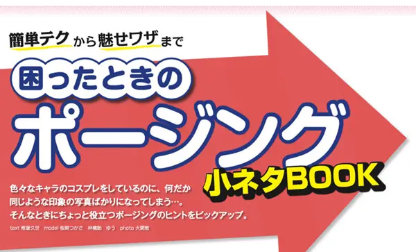
簡単テクから魅せワザまで! 困ったときのコスプレ撮影ポージング | COSPLAY MODE
コスプレ撮影で困った時に役立つポージングのヒントを、女子キャラ・男子キャラごとにご紹介。ひとりでのポーズも、複数人でのポーズも、いつものコスプレ撮影をランクアップさせるアイデアが盛りだくさん!
cosplaymode.netThree People: The Triangle Configuration
Three people are the most naturally cohesive number for group shots. Put the lead in the center with the other two slightly pulled back, or stagger one person high and another low on one side, forming a triangle configuration — eye direction stabilizes almost automatically. The apex gives viewers' eyes a clear place to land and somewhere to move from.
The critical thing is not to put everyone at the same height facing the same direction. Center faces mostly front; flanking figures angle inward or slightly oblique, naturally drawing attention toward the middle. Shoulder, hip, and neck offset makes this work. The center person can keep the hips mostly forward and add only a slight shoulder twist. Flanking figures can let the hips drift outward while the neck alone turns back toward center. That difference produces cohesion from a standing arrangement.
With three people, hand and prop direction can signal roles clearly. The lead concentrates visual information around the face and chest; the supporting two extend weapons, sleeves, hair, or cloaks outward, so the center doesn't get buried. Conversely, having everyone point sword tips inward, or having everyone do the same gesture at the same position, creates too much pressure. Deciding which elements to match and which to break is the real skill.
In my experience, the moment three-person groups come together is when you decide whose triangle it is — meaning, who sits at the apex. Energetic trios work with an upward-pointing triangle; serious or dramatic trios work with a wide, low-centered one. Matching the triangle shape to the characters' nature pre-empts a lot of problems. COSPLAY MODE's piece on multi-person posing and composition calls three-person groups the most forgiving formation, and field experience confirms it — it's the best shape for beginners to learn first.

コスプレ併せで使える! 複数人での映えるポージング&構図を解説 | COSPLAY MODE
複数人での"併せ"撮影で使える構図とポージングを、作例と合わせて被写体人数別にご紹介。 そのまま真似してもよし、アレンジを加えてもよし。ぜひコスプレ撮影の参考にしてみて! ポーズモデル:まめまよ、みおし、Kaor!♡、竹田ネロ、右京 作例モ
cosplaymode.netFour People: Creating Depth with a Chevron Formation
With four, the temptation is a symmetrical V-shape, but that tends to be less stable than it looks. When the outer two carry too much visual weight the center sinks; when the center is emphasized the outer figures feel stranded. A more reliable approach is the chevron — rather than placing everyone on a flat plane, vary the angle slightly so one side angles toward the camera and the other falls slightly back. Four people on one flat plane instantly gains dimension from this alone.
Specifically, use the inner two as a reference line and angle the outer two's toes slightly inward or outward. Shoulders follow the same logic — avoid full front-facing for everyone, let one side open inward and the other turn slightly outward. When the hip angle also shifts slightly, a visible "plane" forms in the image. All four at identical front-facing angles creates a visual collision of costume colors and details that reads as crowded; the chevron dissolves that.
Height differentials complement this beautifully. Drop one person's weight, pull another person a half-step back, tilt one person's neck. I've rearranged groups of four from clean horizontal lineups to a chevron-plus-height-differential and watched the frame sort itself out immediately. The center gains density while the edges find their breathing room. Four people tend to feel cramped relative to their number, so slightly asymmetrical arrangements are almost always stronger photographically than symmetric ones.
For primarily feminine-character groups, adding more S-curve on one side while using straighter verticals on the other keeps the image from reading as overly sweet. For primarily masculine groups, build the foundation with shoulder width and stance, then let the neck alone turn in different directions to create a sense of ensemble. In mixed groups, varying the height at which hands are placed — near the face, at the chest, at the waist, at a weapon grip — scatters the four figures' information across the frame in a way that reads cleanly.
Five or More: W-Formation and Layering
Once you're at five or more, trying to make everyone perfectly organized is exactly what makes the image stiff. Two formation types are worth knowing: the W-shape and layered placement. Rather than a single horizontal row, stagger height and front-to-back depth so the eye has vertical and horizontal pathways to follow. A W-shape with a peak at center, secondary peaks to either side, and the outer figures stepping slightly back makes it harder for the lead to disappear into the crowd no matter how many people there are.
Avoiding over-coordination is the key discipline here. Identical face angles, identical foot directions, identical hand heights compound in intensity as the group grows. Mixing in someone whose toes point a different way, whose shoulders open, whose hips drift outward, whose neck turns back toward center keeps a large group from feeling suffocating. Props work the same way — rather than everyone thrusting forward, distributing directions upward, sideways, and close to the body makes roles legible.
W-formations don't have to put the center person at the absolute front. Pulling the center slightly back and placing the two lead characters forward can be the stronger choice depending on the story — not every ensemble has one protagonist at its heart. Front-row figures should build the lower body strongly; back-row figures should carry expression through neck and shoulder angles so they don't get buried. Nikon Cosgenic Lesson 1's principle of "using space three-dimensionally" scales directly with group size — the more people there are, the more important it is to design depth before individual poses.
ℹ️ Note
When five or more people feel stuck, rather than coordinating everyone into the same pose, try "matching direction for two people maximum, everyone else offsets their shoulder or hip slightly." Prioritize readability over the satisfaction of uniformity — that's when ensemble shots gain real presence.
For primarily feminine-character groups, stacking curves risks dissolving individual outlines; introduce someone holding their neck straight to create vertical lines that anchor the frame. For primarily masculine groups, an ensemble of squared-up power stances gets visually heavy — mix in someone with a leg pulled back or a shoulder relaxed so the image breathes. The fundamental principle for group shoots is to distribute angles by role, not to make everyone match.
Adapting Your Approach: Events, Studios, Home Shoots
Events: Getting Clean Shots in the Queue
At event venues, throughput is the name of the game. At large-scale events, you rarely have long stretches with any one group, so the strongest approach is to find a background with good visual separation and commit to one or two poses immediately (for a sense of event floor scale, see "Comiket 105 — Venue Report" at /cosplay/cosplay-comiket).
The first move is reading the background's information density in a single glance before stepping into position. Heavy signage, passing foot traffic, brightly colored vendor tents, ground markings — these undermine even a well-executed pose. Conversely, a far-off wall, a dark gap between trees, a sliver of open sky, or a corridor that creates compression in the distance all work well under time pressure. At one outdoor event, I positioned a subject in slight backlight with a tree canopy acting as a natural foreground frame, and the skin tones suddenly read as clean and dimensional. Hunting for that kind of "visual separation" genuinely pays off.
For the shoot itself, not having a sequence decided in advance is where time evaporates. Walking up and saying "do whatever feels right" is a recipe for drift. My usual approach: once the position is set, shoot one clean stability shot from the front, then one variation that changes only the face direction or hand placement. The idea is not to build a pose from zero each time, but to set one base and extract differences from it. This method consistently minimizes failures at events.
Pacing also matters for the people around you. As SpaceMarket's guide makes clear, cosplay photography involves not just shooting permission and venue rules but also awareness of others and time management. When queues form, chasing perfection on individual frames is less useful than wrapping up quickly and pleasantly — that's better for the subject and for whoever's waiting next. The stronger your passion for the source material, the more important it is to convert that passion into pace rather than duration.
TGS2025's photo coverage runs to 420 images, and even within the same character, small changes in framing distance, pull distance, and angle produce dramatically different impressions. The same logic applies at events: step half a stride closer, half a stride to the side, or drop into a low angle — these brief position shifts can produce variation without asking the subject to hold the spot any longer. The goal is to maximize frame variation through minimal camera movement, not extended shoots.

第105回コミケ(冬コミ)会場配置図&チケット情報まとめ - サークル配置も一目瞭然【コミケPlus編集部】 | オタスポガイド
第105回コミケ(C105・冬コミ)は、2024年12月29日~30日の2日間、東京ビッグサイトで開催される。今回も1日当たり10数万人規模で開催されるが、先日コミックマーケット準備会からC105に関する詳細情報が公開された。そこで今回は、
otaspoguide.comStudios: Designing the Background and Light in Advance
In a studio, you're not looking to dodge what's already there — you're deciding how to use the background and light before you start. White seamless, classroom sets, derelict-chic booths, curtained room simulations — the background itself carries meaning, so placing the subject without thinking about how much of that background to incorporate tends to waste the space. Deciding in advance "how much of this set do I want in the frame" resolves both placement and focal length questions at once.
A practical rule of thumb: around f/8 when you want the set to read clearly, around f/4 when you want the subject at center stage and the background supporting rather than competing. This range is workable for most cosplay studio scenarios. If the shot needs the desk and window frame of a classroom set to read fully, lean toward f/8; if the atmosphere of a sofa and wallpapered room should be borrowed without dominating, lean toward f/4.
Light works the same way — rather than simply maximizing brightness, role separation is what creates dimension. With one light, commit to a key direction. With two, decide how much shadow to preserve with the fill. With a three-point setup, let key, fill, and back each do a distinct job. A practical fill ratio is about 1/3 to 1/4 of the key light — approximately 1.6 to 2 stops lower. This level softens shadows without erasing them entirely, keeping depth in the face while staying away from flat, washed-out rendering. For the backlight, at least half the key is enough to separate the subject from the background, which particularly shows on dark hair and dark costumes.
In studio interiors, if the shutter speed drops too far, even careful lighting setup falls apart to motion blur. 1/60 sec or above is a reliable baseline for handheld, and ISO 800 usually gets you there in most studio environments. For darker sets, ISO 1600 or above may be necessary — but the underlying principle remains to prioritize stopping blur over maintaining low ISO. The aperture is a creative switch for intent: how much of the set should read versus how much should the subject dominate?
When I'm uncertain in a studio, I look at the background lines first. Window frames, wall seams, floor lines, sofa backs, stair edges — how these emerge from the subject's head and shoulders determines whether the shot feels comfortable or awkward. Even in well-appointed studios, it's tempting to rely on the set's richness, but the shots where background lines and light direction work in alignment are consistently the ones where both costume and expression pop most cleanly.
Home Shoots: Mirrors, Vari-Angle Monitors, and Foreground Creation
Home shoots offer maximum freedom but confine you to the size of your room. The most effective compensation is using a mirror and vari-angle monitor to check your form while treating a tight space as a composition opportunity. Nikon's Lesson 12 on home and self-portrait shooting treats mirrors and vari-angle as the practical backbone of the workflow, and in practice these two tools dramatically speed up corrections to face angle, shoulder height, and how the hands are sitting.
The most common home-shoot failure isn't a bad pose — it's not noticing small alignment problems. Chin slightly elevated, shoulders slightly hunched, wrists held stiffly, the core soft. These minor breakdowns are surprisingly invisible before you press the shutter but obvious when you review afterward. Using the mirror to check the full-body S-curve and weight distribution, then confirming the final frame in the vari-angle monitor, creates a two-stage check that reduces failed frames considerably.
In limited indoor spaces, removing the background isn't the only answer — and often not the best one. A narrow room can benefit more from using foreground elements as a surrogate frame to give the image structure. The edge of a curtain, a blurred shelf, a houseplant's leaves, a door frame, objects on a desk shot through — these can add depth to an otherwise ordinary room. It's the frame-within-a-frame principle applied using furniture and fabric rather than architecture. Even a small foreground element transforms "a record of a living space" into "a photograph."
💡 Tip
In tight spaces where you can't pull back, tidying the entire room is less efficient than placing one soft, blurry element in the foreground of the shot. Think of it as building a path for the viewer's eye rather than hiding the background.
A good starting-point setting for home shoots: f/4, 1/60 sec, ISO 800. This combination slightly softens the background while controlling motion blur under typical indoor light. When you want more background blur but the room is too small, reaching for a slightly longer focal length gets you further than pushing aperture alone. An 85mm equivalent pulling to a bust-length crop keeps the subject prominent but requires more working distance — hard in a studio apartment. Shooting at something like 50mm and stepping slightly closer, or actively creating distance between subject and background, tends to be the more practical solution.
In home shoots, constraints become visible in the photograph. No sprawling location, no expensive studio — but a mirror for posture, a vari-angle monitor for composition, and a foreground element for framing. When these three click together, a corner of a room starts to look like it was designed to be photographed.
How Focal Length, Lens Choice, and Angle Shape the Image
50mm: Your Calibration Baseline
Some photos look natural; others look slightly manufactured. The best lens for understanding why is a standard 50mm equivalent. It approximates the way the human eye perceives relative scale, meaning face, torso, and limbs don't distort in extreme directions — which makes it much easier to honestly evaluate whether a pose is working. As mentioned earlier, 50mm is the strongest starting point when you're unsure.
The reason it teaches well is that posing corrections translate directly into the image without being amplified or softened by the optic. Chin in slightly, shoulder dropped, hip twisted, hand moved slightly off the body — these adjustments show up at face value. That also means a pose that doesn't work at 50mm probably won't be rescued by wide-angle drama or tightly compressed framing. Establishing the baseline at standard focal length is rational.
Shooting at 35mm, 50mm, and 85mm side by side, 50mm consistently sits at the equilibrium point between background visual noise and subject clarity. 35mm admits too much information; 85mm edits too much out. From the middle, it's easy to read whether "this pose works including the background" versus "this pose works as a subject in isolation." Pinning down the first few frames at a 50mm sensibility makes the later decision to go wider or tighter much cleaner.
85mm: Background Simplification for Subject-Forward Shots
Medium telephoto in the 85mm range is where you go when you want to put the subject clearly forward. Background blur is determined by aperture, focal length, and the distance between subject and background — shifting to 85mm reduces background information and channels attention toward the person. It pairs naturally with bust-length or upper-body framing where the goal is to show the face, wig, and costume detail with maximum clarity.
ℹ️ Note
Shooting the same standing pose at 35mm, 50mm, and 85mm and comparing the results shows the background "clutter level" stepping down in stages — useful not just as pose research, but as a concrete study in visual guidance.
Wide Angle: Amplifying Impact While Managing Distortion
Wide angles, particularly the 16–35mm range, can amplify the energy of a pose dramatically. Thrusting a sword forward, running toward camera, jumping, crouching with outstretched hands — action-oriented poses shot wide and close carry forward velocity that makes a still image feel kinetic. Leg extension when one foot is planted toward camera, and the apparent reach of a weapon or arm, are both easy to build in, making wide angles powerful for world-building shots.
The trade-off is that wide angles exaggerate indiscriminately. The near cheek or hand can appear disproportionately large; the foot closest to camera can look unnaturally elongated; a background pillar or wall can appear to topple. That's both the appeal and the difficulty. The same pose that reads as straightforward at 50mm, refined at 85mm, becomes dramatic wide — but a slight positional error tips from "compelling exaggeration" to "accidental distortion."
The way to fail less with wide angles is to deliberately place the element you want to exaggerate nearest the lens. To make legs look long, lead with the legs; to emphasize a weapon's scale, lead with the weapon; for kinetic energy, lead with the forward-reaching arm or shoulder. When the face is closest to the lens despite the intention being a full-body character shot, the character's proportions read as unstable. Wide angle is less "make the pose bigger" and more "decide which part of the pose is the subject" — framed that way, it becomes easier to control. The note that wide-angle shooting in cosplay contexts requires distortion management, found in Coosy and studio-based guidance, comes back to exactly this point.
High vs. Low Angle: How to Choose
Beyond focal length, the height from which you shoot reshapes the character impression significantly. A low angle emphasizes leg length and physical presence, pushing toward strength, authority, and heroic scale. A high angle brings out the openness of the gaze and a sense of slenderness — it tends to carry delicacy, youthfulness, and an everyday warmth.
A crossed-arms, upright pose illustrates this cleanly. Shot at eye level it reads as "a person standing." Shot from slightly below, the same pose instantly gains a commanding quality. Shot from above, even a stern expression softens slightly into something closer to endearing. The angle literally changes what the pose means.
The risk is in treating angles as additive modifiers. Combining wide angle with a strong low shot generates both strong impact and strong distortion simultaneously. Pulling back slightly to 85mm and shooting from a slightly elevated position produces refined simplicity. Lens character and angle character multiply each other, so the goal isn't "compensate for a weak pose with a low angle" — it's "build the angle into the design based on how you want this character to read."
When uncertain, shoot one calibration frame at eye level first, then try low or high. With a reference frame, the judgment of "this pose works better from below" or "shooting high makes the character feel like someone else" becomes immediate. The fact that the same body shape produces different impressions is precisely the point: focal length, camera height, and framing all make meaning together, not separately.
Lighting and Camera Settings at a Glance
Indoor and Outdoor Settings
The practical range for beginners to work within is f/4 to f/8. Near f/4, the subject stays prominent and the background settles into softness; stopping down toward f/8 keeps costume and set detail more readable. Osaka cosplay studio guidance consistently treats this f-stop range as the practical working zone for cosplay photography. When most of your attention is already going toward pose and composition, staying within this range minimizes mistakes.
Indoors, keeping shutter speed at 1/60 sec or above is the foundational principle. Even a completely still subject breathes and shifts weight slightly — at slower speeds, that movement registers. Nikon's Enjoy series lessons lay this out clearly, using ISO 800 to hold 1/60 sec as a starting point. In one dim studio session, I was at f/4 and 1/80 sec and still underexposing — bumping ISO to 1600 immediately steadied the hit rate. Stopping blur takes priority over keeping ISO low.
The practical indoor workflow, then, is not "decide between f/4 and f/8 first" but rather lock 1/60 sec or above and use ISO to manage exposure. Start at ISO 800; if that's not enough, go to ISO 1600. Digital Camera Watch examples confirm that ISO 1600 and above is frequently necessary in dark interiors. A slightly grainy but sharp frame is almost always more salvageable than a properly exposed but soft one.
Outdoors, more available light means more room to maneuver. For clean full-body shots in direct light, f/5.6 to f/8 is generally enough; if you want to separate the subject slightly from the background, lean toward f/4. The principle is the same — connect each aperture choice to what you're trying to show, rather than memorizing numbers. If the architecture or set is part of the story, stop down; if the face and costume details should hold the frame, open up. That thinking alone reduces on-set uncertainty dramatically.
Building Up from One Light to Three-Point Lighting
Lighting doesn't need to be complex from the start. Learn what each light does and add from there — that's the most natural progression. LUZZ STUDIO's two-light breakdown and Borderless's three-point lighting explanation both pair well with this "roles become clearer as you add lights" understanding. What distinguishes experienced shooters isn't the number of lights — it's whether they can articulate what each one is doing.
At one light, focus entirely on the key light. The key determines where the face is lit from, how the nose shadow falls, how costume textures emerge, and where the image's bright-to-dark gradient runs. One light means shadows run strong, but it also creates a clear learning environment: which direction makes this character come alive? Straight front-lighting maximizes information but flattens easily; a slight off-axis key introduces dimension.
Adding a second light brings in the fill. Fill's role is to soften the shadows the key creates — not eliminate them but make them readable. The working guideline from Borderless puts fill at 1/3 to 1/4 of the key, approximately 1.6 to 2 stops below. Think of it as a light that shows you what's inside the shadow, not one that removes it. This ratio is part of what prevents beginners from over-cranking the fill in an attempt to "just make it brighter" and accidentally flattening the image.
Three-point lighting adds a backlight. The back light traces the contour of the subject from behind, creating separation from the background — it's the light responsible for the subject feeling as though they exist in three-dimensional space rather than floating against a flat plane. It's most effective against darker backgrounds, with dark costumes, and whenever hair and background risk merging. Borderless puts the backlight at at least half the key, which is enough for a thin rim of light along the shoulder and hair to lift the subject cleanly forward.
Understood this way, lighting is not about acquiring gear — it's about the key establishing form, the fill refining it, and the back separating it. A beginner who works through single-light key positioning and then learns to control shadow with fill will see genuine results, well before needing to set up a complete three-point rig. Three-point lighting is best thought of as a vocabulary for assigning roles, not a required starting configuration.
Cross Lighting, Backlight, and Bounce Basics
For three-dimensional quality, the first technique worth internalizing is cross lighting — placing the light source at an angle to the subject rather than directly in front. This off-axis approach, common to Osaka cosplay studio technique and Nikon's dimensionality-focused content alike, prevents people from reading as flat. Even a faint shadow on one side of the face creates depth in the cheekbone, the bridge of the nose, and the folds of the costume.
The beginner trap with cross lighting is treating shadows as failures. In cosplay photography, a small amount of shadow is often what creates character and texture. Weapons, jackets, armor, and heavily decorated costumes all read as more detailed under slightly angled light than under flat front illumination. If the goal is dimension but the only light is coming from directly in front, the information is visible but the impression stays thin.
Backlight becomes intuitive once you stop treating it as a source that brightens the face. Backlight creates silhouette, atmosphere, and air. It's most effective at the edges of the hair, the shoulder line, the tip of a weapon, the translucency of a veil or cape — the details that make a shot feel like it came from the work itself rather than from a camera. The connection to the backlight role in three-point setups is direct: separating the subject from the background is its primary function. If the face goes dark, a reflector or auxiliary fill brings it back up.
The technique to add alongside these is bounce lighting — directing flash or continuous light at a white wall, white ceiling, or white board and using the reflected light rather than the direct source. Reflected light is softer, dramatically reduces harsh specular highlights on skin and reflective costume materials, and is far less likely to blow out in ways that are hard to fix. In home shoots and smaller studios, bounce often handles problems more cleanly than direct light.
💡 Tip
When lighting feels overwhelming, reframe the question from "where do I want brightness" to "where do I want a soft shadow to remain." Dimension comes from the placement of contrast, not from the amount of light.
Cross, backlight, and bounce aren't separate techniques — they're all methods for preventing the subject from reading as flat. Cross establishes form, backlight defines the outline, bounce takes the hardness off. These three principles alone are enough to make single-light work feel considered.
Practical AF Settings and Smartphone Shooting
Autofocus is more useful when you match the mode to the situation than when you try to optimize one mode universally. Situations with movement — rapid pose changes, walking shots, high-energy action poses — benefit from AF-C tracking. Static poses where you're composing carefully benefit from single-shot AF: lock focus on the face, then reframe. At event portrait queues where neither the subject nor you is completely still, AF-C tends to catch more keepers than you'd expect.
In deliberate studio setups, single-shot can be more accurate when you need a specific focus point — do you want the eye in sharpest focus, or the front edge of the wig with the eye just behind it, or the tip of the weapon at the same depth? None of these modes is inherently superior; the practical split is simply AF-C for movement-heavy situations, single-shot for controlled static poses.
For smartphone photography, where fine-tuning camera settings isn't always possible, getting the light right is the primary stabilizer. The most failure-resistant approach is window light from the side or slightly behind the subject. Ceiling fluorescent directly above hollows out the face; flat frontal room lighting kills color. Window light scatters across a broader plane and smooths naturally. Add a white piece of paper or a white board as a makeshift reflector on the opposite side and the shadow intensity drops noticeably.
This approach is particularly strong for home shoots. Nikon's self-portrait content discusses mirror and vari-angle monitor use, but the light-source logic applies equally on smartphones. Rather than trying to compensate for a dark room with processing, position relative to the window and adjust the reflector — the results stabilize dramatically. Skin tone, color accuracy, and costume rendering all land more reliably in window light than under boosted room lighting. Sometimes the simplest solution really is just moving to where the natural light is.
Common Mistakes and On-the-Spot Fixes
Pose and Hand Placement: Immediate Corrections
The two most common on-set problems are the stiff stand and hands with nowhere to go. The costume and wig can be perfect, yet the moment it's photographed it looks like the person is getting their picture taken for an ID. The body's axis is too straight. Rather than rebuilding the entire pose, shifting hips and shoulders slightly into an S-curve is usually enough to fix this immediately. Weight to one foot, opposite shoulder slightly back — that single change creates flow through the standing figure and moves toward what COSPLAY MODE's posing articles describe as "a stance that doesn't look frozen."
Hand placement also seizes up when left entirely open. The moment of hesitation is where everything locks. On set, reducing it to a four-option menu and deciding instantly is faster than open-ended thinking. The four: cheek, collarbone, hip, prop. Cheek adds softness and draws attention up toward the face; collarbone reads well alongside eye direction; hip sharpens the full-body line; prop layers in character context. I'll often just ask quickly — "cheek or neck or hip, which one?" — and the hands immediately stop dangling.
The other adjustment that works consistently is thinking in terms of following the silhouette rather than placing the hand in the center of the body. Arms glued to the torso widen the silhouette; letting the elbows come slightly away from the body and placing the fingertips outside the silhouette line restores definition. If the hand is on the cheek, avoid showing too many fingers; if it's on the hip, align the thumb direction. These minor finishing touches are the difference between "a hand placed somewhere" and "a hand with a purpose."
Background and Framing Cleanup
When the background is too busy, the reflex of giving up is exactly wrong. Most of the time you don't need a large camera move to fix it. Half a step sideways often does the job. Posters, signage, pedestrians, column seams — from dead-on these all stack up behind the subject, but moving half a step tends to move the subject out from in front of them. I've cleared up shots in poster-covered venues with just a half-step sideways and switching from center to rule-of-thirds composition.
For faster background cleanup, an 85mm-ish perspective at around f/4 is consistently the most efficient combination. As discussed in the earlier section, medium telephoto compresses the background while f/4 takes the edge off what remains. TAMRON's bokeh explainer organizes this as the relationship between aperture, focal length, and subject-to-background distance, but on set the practical summary is just "go a bit longer and open up slightly." The combination cuts through cluttered walls and crowd backdrops in a way that's hard to replicate otherwise.
For composition, the frame-within-a-frame is the other reliable tool. Doors, windows, pillars, arches, gaps in hedges — surrounding the subject in a natural frame gives the eye a destination even when the background behind them is dense. COSPLAY MODE's composition coverage describes this as the composition that keeps location character while foregrounding the subject. The mental model is pushing the cluttered information outside the frame rather than trying to erase the background.
When the full body doesn't fit in frame, pulling back to create room risks letting in everything you don't want. A more reliable solution is to clear the foreground — move luggage, chairs, floor-level shadows, or anything entering from the bottom of the frame — and the necessary space often appears. On framing: avoid clipping the toes. If you're cutting the frame, cut intentionally at the knee or thigh. A full-body shot where only the feet are slightly missing reads as an accident; a deliberate mid-thigh crop reads as a choice.
ℹ️ Note
When the background looks cluttered, the faster fix is to move your standing position half a step before reaching for a different lens. Once you've moved, try nudging the composition from center toward rule-of-thirds or frame-within-a-frame — that combination resolves most on-set framing problems.
Managing Pressure and Distance in Group Shots
The most common issue in multi-person shots is that everyone moves too far forward and the frame feels airless. The faces are all visible, but the result is suffocating rather than dynamic. This happens more often with close-knit groups — when people are comfortable together, they unconsciously crowd each other. The fix is simple: open the spacing slightly and introduce front-to-back depth. Instead of a tight horizontal row, pull one person a half-step back and push another a half-step forward — air moves back into the frame.
Arrangement geometry also matters. As COSPLAY MODE's multi-person pieces note, the more people there are, the more a straight-on horizontal row hardens into a wall. The W-shape and chevron are useful here — pulling the center slightly back to receive both sides, or angling one side diagonally, creates directional flow in the frame. Three-person groups stay manageable, but four and above tend to lose structure in a V if you try to balance everyone equally. Deciding the lead's facing direction and how the supporting figures receive that flow produces a tighter result than trying to give everyone equal visual weight.
To reduce the "wall" quality, think about the group in lines rather than surfaces. When every shoulder faces the camera simultaneously, the group reads as a flat panel. Rotate some people slightly and depth opens up. The same applies to props and arms — everyone thrusting forward doubles the pressure; distributing directions between forward, sideways, and close to the body makes individual roles readable. An ensemble isn't powerful because of its numbers — it's powerful when the differences in distance and angle carry the story.
Recovering from Dark-Location Blur
The mistake that causes dark-location failures is fearing ISO while the shutter creeps lower. The on-set recovery sequence is clear: first, lock shutter speed at 1/60 sec or above. Below this threshold, static poses start producing motion-blurred frames at a surprising rate. Digital Camera Watch's exposure guidance for low light consistently anchors around "stop blur first, then compensate with sensitivity."
From that baseline, raise ISO to reach correct exposure. ISO 800 works for many interior locations; darker event venues or dim studio setups regularly need ISO 1600 or above. The choice between a slightly noisy frame and a soft frame is not a close call. A blurred frame can't be recovered. A noisy frame can be addressed in processing, and more importantly, a sharp noisy frame reads as present and alive in a way a soft one simply doesn't.
When blur persists despite settings, adjust the shooting approach rather than just retaking. Rather than more burst shooting, asking the subject to hold the peak of the pose for a moment is more effective. Wind in the hair, a weapon mid-swing, fabric flowing — these create atmospheric shots, but in darkness they easily generate subject motion blur. "Hold still on that one for just a second" dramatically improves the success rate. The throughline from the lighting section applies here too: in dark conditions, a clearly defined static pose will almost always outperform a dynamic one.
On-Set Verbal Cues
Not giving clear cues during a shoot causes problems that go deeper than camera settings. Leaving pose decisions entirely to the subject tends to produce stiff stands, uncertain hands, and disengagement from the background all at once. Field experience from practical shooting guides like the Tsukihara notes confirms that tightly sequenced, short verbal prompts work better than long explanations. Three words at a time are dramatically more actionable than a sentence.
The three points that work consistently are gaze, chin, hands. "Eyes this way" / "chin in just a bit" / "hand to your cheek." "Look away" / "chin up a little" / "hand on the hip." "Eyes up and right" / "chin stays" / "show the prop." Rather than correcting everything at once, deliver one point at a time in short bursts. The subject's processing bandwidth stays clear and the adjustments land faster.
The other piece that matters at least as much: "Yes, that's it — right there" the moment a correction lands. This feedback keeps the subject holding the shape they've just achieved and creates momentum for the next micro-adjustment. Without it, shooting in silence gradually erodes the form, because the subject has no confirmation that the current position is what you want. Strong on-set communication isn't about saying clever things. It's about short corrections and immediate positive feedback. When the shooter's rhythm is right, the photographs follow.
Pre-Shoot Checklist and Etiquette
Preparing in Advance
Before any question of technical execution, the foundation is making sure you have the conditions to shoot in the first place. Cosplay photography isn't purely a technical skill — event rules, venue restrictions, and the subject's explicit consent are all part of the system. Across SpaceMarket's etiquette guide, Studio YOU's FAQ, and WCS FAQ, the consistent message is that verifying the rules before you start is non-negotiable.
The things most easily missed are designated shooting zones and equipment restrictions. Some venues prohibit shooting near changing areas or in corridors; tripods, large light stands, and strobes may come with conditions attached. What looks "small enough" by your own judgment may not meet the venue's standard. Even in studio rentals, equipment that risks wall or floor damage, uncushioned placements, or spreading gear into shared spaces is typically unwelcome.
Shoot permission from the subject shouldn't be left vague at the outset. At events, the flow can make it feel like one quick portrait just happened — but verbally confirming before shooting is the baseline. For planned group or individual shoots, go further: agree in advance on what will be captured, whether it's solo-priority, whether the full sequence includes group shots, and whether props are in scope. Resolving this before the day minimizes tension on set.
Time management matters too — one minute of overrun ripples through every schedule that follows. At events, changing, transit, shooting, queue wait, and pack-down are all sequenced on a timeline, so respecting the time allocation is itself the courtesy. In my own experience, the people who shoot most efficiently at busy events are the ones who decided what they were going to shoot before they arrived. Preparation isn't just about shot quality — it directly affects how much your presence costs other people.
💡 Tip
The advantage on set belongs to the person who has already sorted rules, permissions, equipment, and timing before the day begins. With those four locked, everything at the location can go toward actually shooting.
On-Site Etiquette
Before "getting good shots," the discipline of not blocking the space matters — without it, you're consuming other participants' time as well as your own. At event venues, photographers and subjects are both participants, and not monopolizing shared space is the baseline expectation. At large events, crowding queue lines, blocking corridors, and spreading luggage across shared pathways are the most visible friction points.
What causes problems more often than the shooting itself is behavior during transitions and waiting. Spreading out while waiting for a turn, staying in the foot traffic flow mid-conversation, reviewing images in place after the shoot is finished — these behaviors stall the venue's circulation. At smaller scale they seem minor; across a packed event they compound into real congestion. A cosplay event like Kabu-cos 2026, as covered by Niconico News, targets 100 cosplayers and 50 photographers — 150 participants. At that density, one group's extended stay at a spot creates noticeable ripple effects.
During shooting, not blocking walkways and honoring turns and time allocations are the practical etiquette commitments. A low-angle or crouching shot can make it easy to lose track of the foot traffic behind you; stepping back to create space for a wider composition can put you straight into someone else's queue lane. In those situations, repositioning is more important than pursuing the composition. Bluntly: someone who takes technically strong shots while ignoring the people around them loses the trust of the community quickly.
Being mindful of unintended inclusions in the frame is non-negotiable. Other participants appearing in the background is an inherent reality at events, but inadvertently capturing someone's face at close range, catching a changing area in the background, or getting a name badge clearly in frame creates real problems. WCS FAQ addresses this explicitly, and at large-scale events the stakes are higher. I've caught a third party's face and a name tag in a background while reviewing before posting — that brief check before uploading prevented what could have been an uncomfortable situation. Those few extra seconds of review are worth it.
Consent and Consideration Before Posting to Social Media
After the shoot, the next step is confirming whether each image is okay to share. This sits on a separate axis from technical execution, but it's fundamental to cosplay culture. Shooting being okay does not automatically mean posting is okay. The specific parameters people care about vary: which platform, which frames, whether to tag, how to credit the source material, whether an account mention is wanted, how edits are handled, whether the poster or subject shares first.
Walking through the details — not just "I want to post this" but where and how — closes the gaps that turn into awkwardness later. Someone may be fine with a post to X but uncomfortable with the same image cut into a short-form video. They might want the series title tagged but not the event name. A face-close shot may be fine to post; an unedited full-body may not be. Leaving these ambiguous at shoot time is comfortable in the moment but risky at post time.
Third-party inclusions require extra care. If another participant's face is clearly identifiable, either get permission or blur it. The same applies to event staff signage, partial changing area backgrounds, and name badges appearing in frame. People in my social circle have caught these through careful pre-post review and made the call to swap frames or add a blur before uploading. Conflicts tend not to begin dramatically — they begin with these kinds of overlooked details.
Social media spreads fast, and low-level friction in person can scale into something much larger once it's public. That's exactly why consent with the subject and awareness of who else is in the frame deserve to be treated as part of the shoot itself rather than a post-production afterthought. The same "plan it in advance" instinct that applies to posing and composition applies here too — and it leads to the same thing: confidence in what you're doing when it counts.
A Closing Action Plan for Shoot Day and Beyond
The fastest way to improve from today isn't adding more techniques — it's fixing the order of your decisions. Name the vibe in words first, compare your options on set, record your reasoning afterward. Once that loop is running, the successful frames stop being lucky and start being reproducible. Since I started keeping even rough notes, "what worked this time" stays in memory rather than dissolving, and the time I spend uncertain at the next shoot has genuinely gone down.
Related Articles
Comiket 105 (C105) Report: Standout Cosplay, Trending Doujin Works, and Corporate Booth Highlights
Comiket 105 (C105) Report: Standout Cosplay, Trending Doujin Works, and Corporate Booth Highlights
Cosplay Initial Budget Guide — Starting Out for ¥30,000–¥40,000 (~$200–$270 USD)